1. 绘制 detectron 目标检测的 loss-accuracy 曲线
首先使用 tee 命令将训练日志重定向到日志文件 train_info.log
$ python tools/train_net.py --cfg experiment/fast_rcnn_resnet50_FPN.yaml OUTPUT_DIR experiment/detectron_result | tee experiment/train_info.log
训练日志的主要内容为
json_stats: {
    "accuracy_cls": 0.000000,
    "eta": "29 days, 16:00:50",
    "iter": 0,
    "loss": 6.594362,
    ...
    "lr": 0.003333,
    "mb_qsize": 64,
    "mem": 9376,
    "time": 14.240279
    }
根据训练日志绘制 loss-accuracy 曲线的 python 脚本如下:
import json
import re
import matplotlib.pyplot as plt
import numpy as np

log_file = 'experiment/train_info.log'
with open(log_file) as f:
    # 提取信息
    pattern = re.compile('json_stats: {.*}')
    info_list = pattern.findall(f.read())

    parsed = None
    try:
        parsed = [json.loads('{' + string.split('{')[1]) for string in info_list]
    except:
        print('Json format is not correct !!!')
        exit(1)

    if parsed:
        iter = np.array([int(string['iter']) for string in parsed])
        loss = np.array([int(string['loss']) for string in parsed])
        accuracy = np.array([float(string['accuracy_cls']) for string in parsed])
        # 绘制图形
        plt.figure('Figure of Loss-Accuracy', figsize=(8,6), frameon=True)
        plt.plot(iter, accuracy, color='red', linestyle='--', linewidth=1, label="accuracy")
        plt.plot(iter, loss, 'b-', lw=1, label='loss')

        plt.xlim((iter[0], len(iter)))
        plt.ylim((0, max(loss)))
        plt.title('The Information of Loss and Accuracy', color='green')
        plt.legend(loc='upper right')
        plt.show()
    else:
        print('There is no loss information in file "{:s}".format(log_name)')
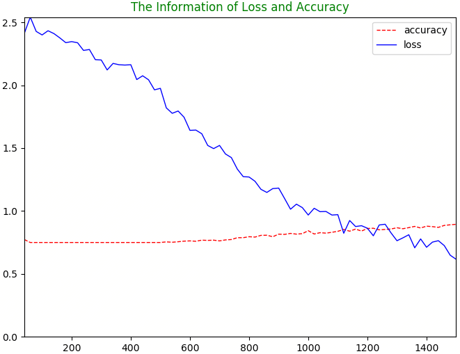
loss-accuracy 曲线的图形示例如下
2. 检测结果可视化
$ python tools/visualize_results.py \
      --dataset experiment_val \
      --detections experiment/detections.pkl \
      --output-dir experiment/result_jpg